
You hand a corporate event planner your card after a successful tasting, and watch them immediately flip it over to find a booking link or a menu portfolio, only to find a blank white back. In the hospitality industry, restaurant business cards are rarely used just to share a phone number. They are expected to bridge the gap between an offline interaction - a meal, a conversation at a food festival, or a venue tour - and an immediate online action, such as reserving a table, reviewing a catering menu, or saving your contact details to a digital wallet.
Quick Summary
Restaurant business cards are physical networking tools engineered to convert offline hospitality interactions into direct digital engagement. A well-executed card balances tactile branding with clear, scannable calls to action that route potential diners and corporate clients directly to booking systems or centralized digital hubs.
- Establish a single primary action per card, such as booking a table or downloading a catering menu.
- Choose materials that resist moisture and grease common in hospitality environments.
- Transition from cluttered text to hybrid physical-digital designs using scannable QR codes.
- Align the card's tactile feel with your venue's interior design and price point.
Table of Contents
- Step 1: Define the Primary Goal of the Card
- Step 2: Select the Right Material and Finish
- Step 3: Implement a Clean Information Hierarchy
- Step 4: Integrate the Physical with the Digital
- Common Pitfalls & Troubleshooting
- FAQ
- Recommended Reads
Step 1: Define the Primary Goal of the Card
A card handed to a walk-in diner requires entirely different information than one given to a wedding planner. The first mistake operators make is attempting to serve both audiences with a single print run. A general manager's card needs a direct phone line and an email address for vendor relations, while catering business cards must immediately route the recipient to a seasonal menu PDF or a lead generation form.
Identify the precise moment this card changes hands. If your primary use case is leaving cards in the check presenter for diners to take, the goal is repeat business and social sharing. That requires minimal contact data and a prominent link to a reservation platform. If you are attending corporate networking events to secure B2B catering contracts, the card must establish personal authority and provide direct access to your pricing structures and event portfolios. Attempting to cram your address, opening hours, social media handles, and personal cell phone onto a 3.5 by 2-inch canvas results in a chaotic design that fails at everything. Decide what the recipient needs to do next, and strip away any information that does not serve that specific action.
Step 2: Select the Right Material and Finish
The hospitality industry is tactile. Diners judge a restaurant by the weight of its cutlery and the texture of its napkins; they will judge your brand by the business card texture as well. Uncoated, heavy-stock paper (16pt or higher) conveys a rustic, artisanal feel suitable for farm-to-table concepts or craft bakeries, as it absorbs ink deeply and feels raw in the hand. However, uncoated paper also absorbs grease and moisture instantly, making it a poor choice for food truck operators or bustling kitchen environments.
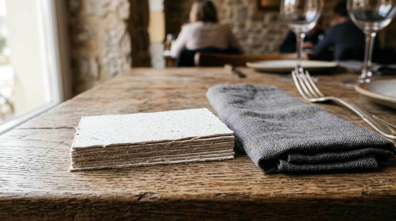
For high-volume, fast-casual venues, a matte or soft-touch lamination provides a protective barrier against fingerprints and minor spills while maintaining a premium feel. Fine dining establishments often utilize foil stamping or embossed logos on thick, minimalist cardstock to mirror the elegance of their plating. You must match the material to the environment where the card will be handled. A glossy finish is durable but notoriously difficult to read under the dim, atmospheric lighting typical of upscale dining rooms due to glare.
Practical rule: Never use a high-gloss finish if your card relies on a QR code; the glare from overhead lights will prevent most smartphone cameras from scanning it properly.
When exploring options, consider the Modern Business Card Design Trends for Restaurants and Catering to see how specific finishes communicate brand identity before a single word is read.
Step 3: Implement a Clean Information Hierarchy
Legibility dies when you treat a business card like a flyer. A simple business card design forces you to prioritize information based on how the human eye scans a small surface. The front of the card should contain only the logo, the brand name, and potentially a concise tagline or the individual's name and title. The negative space around these elements is what draws the eye and communicates confidence.
On the reverse side, group the functional elements. Align contact details either left or right, never center-justified, as center alignment creates jagged reading edges that slow the eye down. Use a highly legible sans-serif font for phone numbers and URLs at a minimum of 7pt size. Script fonts, while popular for restaurant logos, become illegible at small sizes and should never be used for critical contact data. If your address is complex or hidden inside a larger building, do not waste space writing out directional instructions. Instead, provide a digital touchpoint that handles mapping automatically. To understand how spacing impacts legibility, review these Strategic Layout Strategies for Restaurant Business Cards.
Step 4: Integrate the Physical with the Digital
A printed card is static, but hospitality is dynamic. Menus change seasonally, opening hours adjust, and promotional offers expire. Printing this volatile information directly onto paper guarantees your card will be obsolete within months. A truly functional business card solves this by moving the volatile data to a centralized digital hub, connecting the physical card to the internet via a prominent, high-contrast QR code.
Instead of printing your Facebook, Instagram, and TikTok handles alongside your website and reservation link, print a single QR code accompanied by a clear call to action, such as "Scan for Reservations & Seasonal Menus." When scanned, this directs the user to a mobile-optimized bio link page where they can book a table, download a catering PDF, or save your contact details directly to their Apple or Google Wallet. This hybrid approach keeps the physical card immaculately clean while providing infinite digital utility. It also allows you to track scan analytics, finally giving you data on how many of those cards left in the check presenter actually result in return traffic. If you are building a system like this, exploring Modern Business Cards: Functional Design Choices for 2026 will help clarify how to balance the physical layout with the digital handoff.
Common Pitfalls & Troubleshooting
The QR Code Fails to Scan
- Symptom: Clients mention that they tried to scan your card but their phone camera didn't register anything.
- Diagnosis: This is usually caused by insufficient contrast between the code and the background color, printing the code too small (under 0.8 inches), or using a glossy finish that reflects ambient light directly into the camera lens.
- Fix: Reprint with a matte finish, ensure the QR code is stark black against a white or very light background, and maintain a minimum size of 1 inch square with an empty "quiet zone" margin around it.
The Contact is Lost in Translation
- Symptom: You hand out fifty cards at a tasting event, but receive zero follow-up emails, even though attendees seemed highly engaged.
- Diagnosis: The card lacks a digital off-ramp. If an event planner has to manually type your complex restaurant URL and then hunt for the catering contact form, they will abandon the task. Friction kills conversions.
- Fix: Transition from passive information presentation to active lead generation. Use the card to direct them to a digital hub where they can click a single button to download your event package or save your vCard file to their phone.
Rapid Wear and Tear
- Symptom: The cards kept in your apron or at the host stand have frayed edges and smudged ink before you even hand them out.
- Diagnosis: The paper stock is too thin (14pt or less) and lacks a protective coating, making it susceptible to the ambient humidity, grease, and friction common in restaurant operations.
- Fix: Upgrade to a minimum 16pt stock and apply a silk or soft-touch coating. If cards are stored near the kitchen, keep them inside a hard-shell protective case rather than loose in a pocket or drawer.
FAQ
Should I put my photo on a restaurant business card?
Generally, no. Unless you are a celebrity chef whose personal brand is the primary draw of the venue, a headshot clutters the design and detracts from the restaurant's branding. Focus on the venue's logo and a clean presentation of your role and contact details.
How many cards should I order at once?
Order in batches of 250 to 500 max. Staff turnover, menu shifts, and rebranding happen frequently in hospitality. Ordering 5,000 cards to save a few cents per unit usually results in throwing away boxes of outdated materials a year later.
Are physical cards still necessary if I use a digital wallet card?
Yes, physical cards remain crucial in hospitality. You cannot tap a smartphone against a check presenter, and handing a physical token to a diner or vendor leaves a lasting, tactile impression that a purely digital exchange lacks. The most effective strategy uses a physical card as the delivery mechanism for a digital wallet link.
What size should a hospitality business card be?
Stick to the standard 3.5 x 2 inches. While square or die-cut cards (like a card shaped like a coffee cup) stand out initially, they do not fit smoothly into standard wallets or cardholders, increasing the likelihood that they will be thrown away or lost.