
You unbox a newly printed batch of 500 cards, anticipating a crisp, professional finish, only to find the text is muddy, the logo is shifted two millimeters to the left, and a white hairline edge runs along the bottom. This is the exact moment most professionals realize that sending a digital file to a physical printer is not a direct translation. Designing Wix business cards or using a custom print-on-demand service requires moving from a digital RGB screen to physical CMYK ink, and the platforms do not automatically fix your layout mistakes. Before you upload a logo and hit print, you have to understand bleed margins, color profiles, and paper stock mechanics.
Quick Summary
Printing custom business cards online requires properly configuring your digital canvas for physical production, managing color profiles, and selecting the correct paper stock. Relying solely on default platform templates often results in resolution drops and alignment errors during the final cut.
- Establish a 0.125-inch bleed margin to prevent white edges after trimming.
- Convert all digital assets to CMYK color profiles before uploading to avoid dull color shifts.
- Use vector graphics for text and logos to maintain sharpness.
- Select a paper weight of at least 16pt for durability and professional feel.
- Always request a physical or high-resolution digital proof before authorizing a bulk print run.
Table of Contents
- 1. Select the Right Print Platform
- 2. Configure the Canvas and Bleed Margins
- 3. Import Assets and Manage Typography
- 4. Control Color Profiles and Ink Density
- 5. Select Paper Weight and Finishes
- Common Pitfalls & Troubleshooting
- FAQ
- Recommended Reads
1. Select the Right Print Platform
The first failure point in producing a physical networking tool is choosing a platform based solely on its template library rather than its printing specifications. Different services prioritize different parts of the workflow. Some are software-first companies that outsource the printing, while others are commercial printers that offer a basic web interface. Understanding where a platform excels and where it cuts corners determines the quality of your final product.
When ordering custom business cards online, you are generally choosing between integrated website builders, dedicated commercial print hubs, and template marketplaces. Integrated builders often provide a seamless experience if your brand assets are already hosted there, but they may restrict your paper choices to standard weights and basic finishes. Conversely, commercial print hubs offer extensive control over the physical product - die-cuts, spot UV, foil stamping - but their online design interfaces are frequently cumbersome and lack modern typography options.
Many professionals also explore template marketplaces. Buying Etsy business cards, for example, usually means purchasing a digital layout created in a third-party application. You must customize this layout yourself and then export the file to send to a commercial printer. The mistake people make here is assuming the template creator formatted the document for print. Often, these templates are built in RGB color spaces and lack the necessary bleed margins, leaving you to fix the technical specifications before the printer will accept the file. If you are handling the layout yourself, reviewing top design tools for creating custom cards is a better approach than blindly trusting a pre-made marketplace file.
2. Configure the Canvas and Bleed Margins
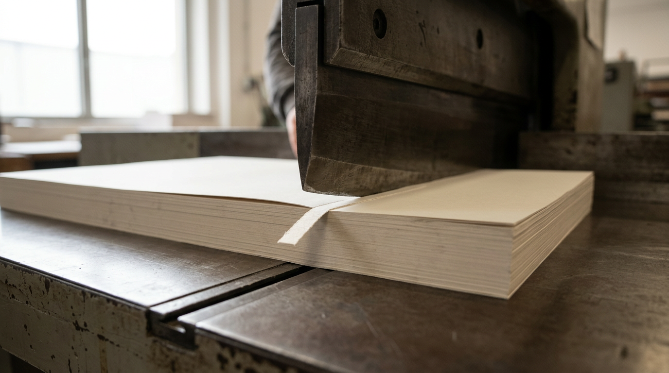
A printing press does not cut paper with microscopic precision. Large sheets of cardstock pass through industrial trimmers, and the blade can shift by up to 0.125 inches (one-eighth of an inch) in any direction. If your background color stops exactly at the edge of your design, a shift in the blade will leave a glaring white sliver along the side of your card.
To prevent this, you must build three distinct zones into your canvas: the bleed, the trim line, and the safe area. The standard US business card measures 3.5 by 2 inches. However, your digital canvas must be set to 3.75 by 2.25 inches. This extra 0.125-inch perimeter is the bleed area. You must extend any background colors, patterns, or images all the way to this outer edge. The trim line is the intended 3.5 by 2-inch cut. The safe area sits 0.125 inches inside the trim line (3.25 by 1.75 inches). Absolutely no essential text, logos, or contact information can sit outside the safe area.
When you do your visiting card design online, the software may hide these margins by default. The mistake users make is dragging a logo until it looks visually balanced on the screen, entirely ignoring the safe zone. When the cards arrive, the last digit of their phone number is sliced in half. Always enable the ruler and grid overlays in your browser editor before placing a single element.
3. Import Assets and Manage Typography
The transition from a glowing screen to porous paper destroys fine details. Text that looks crisp at actual size magnification on a retina display will often blur into illegibility when stamped onto uncoated paper. This happens because users upload rasterized text or low-resolution PNGs instead of scalable vectors.
When you edit business card layouts inside a browser, ensure your logo is uploaded as an SVG or high-resolution PDF. Raster formats (like JPEG or PNG) are built from square pixels. When the printing plate tries to render the curved edge of a letter "O" using square pixels, it creates a jagged, stair-step effect. Vector formats use mathematical paths, meaning the printer can render the curve perfectly smooth regardless of the size.
Typography requires strict sizing rules. Never use a font smaller than 7pt for contact information, and avoid lightweight or "hairline" font variants. During the printing process, liquid ink spreads slightly as it absorbs into the paper fibers - a phenomenon called dot gain. A hairline font will simply disappear, while small, bold text will bleed into itself, turning an "e" into a solid black circle.
Practical rule: Print your design at actual size on a standard desktop laser printer; if you have to squint to read the email address on standard printer paper, it will be completely unreadable on the final cardstock.
Integrating digital features requires the same discipline. If you plan to create a digital business card with QR codes, the QR matrix must be generated as a vector and sized no smaller than 0.8 by 0.8 inches. Anything smaller risks failing to scan under poor lighting conditions, rendering the digital bridge useless.
4. Control Color Profiles and Ink Density
Your computer monitor emits light using Red, Green, and Blue (RGB) pixels. A printing press absorbs light using Cyan, Magenta, Yellow, and Key/Black (CMYK) ink. The RGB spectrum can display neon greens, vibrant pinks, and electric blues that physically cannot be reproduced using standard CMYK inks.
If you design in RGB and send that file to print, the printing software will automatically force the colors into the CMYK spectrum. The vibrant navy blue you chose will suddenly look like muddy denim. The mistake here is trusting the browser preview. Web-based design tools often operate entirely in RGB because web browsers cannot natively display CMYK. You must manually check the color values of your brand assets before uploading them. If your brand guidelines only provide HEX codes (an RGB format), you must use design software to find the closest CMYK equivalent before relying on fast and reliable custom business card printing services.
Black ink is particularly problematic. In digital design, black is just #000000. In print, standard black is achieved by using pure Key ink without adding Cyan, Magenta, or Yellow. However, standard black often looks dark gray when printed over large areas. To get a deep, dark black background, printers use "Rich Black" - a mix of all four inks. The critical failure point is using Rich Black for small text. Because the printing press has to lay down four separate layers of ink perfectly aligned, any microscopic shift in the plates will cause the cyan or magenta to bleed out from the edges of your letters, making the text look blurry and out of focus. Always use pure Key ink for text, and reserve Rich Black only for large background shapes.
5. Select Paper Weight and Finishes
The physical tactile experience of handing someone a card communicates more about your business than the logo printed on it. Paper is measured in points (pt) in the US, referring to the thickness of the sheet in thousandths of an inch.
The industry standard for cheap, promotional handouts is 14pt stock. It feels flimsy, bends easily in a wallet, and signals a low-budget operation. For a professional networking tool, 16pt is the absolute minimum acceptable weight. It provides snap and rigidity. For high-end applications, many printers offer 24pt or 32pt stocks, often created by gluing multiple layers of paper together.
Beyond weight, the coating dictates how the ink behaves. Glossy coatings make photos and vibrant colors pop, but they show fingerprints instantly and are impossible to write on with a standard pen. Matte finishes provide a smooth, professional feel but tend to dull darker colors. Uncoated stock absorbs the most ink, creating a muted, textured look that works well for minimalist, typography-driven designs.
The mistake buyers make is mismatching the finish to the function. If your networking strategy involves writing a direct phone number or a specific meeting time on the back of the card, a UV gloss finish destroys that utility. You must customize your own business cards online with the actual networking interaction in mind, not just the visual aesthetic.
Common Pitfalls & Troubleshooting
Evaluating the final printed batch requires diagnosing failures accurately so you can correct the file for the next run.
Muddy or Blurry Black Text
- Symptom: The text looks slightly out of focus, and if you look closely with a magnifying glass, you can see cyan, magenta, and yellow halos around the black letters.
- Diagnosis: You used Rich Black for your typography. The printer had to align four color plates for fine text, and the registration was slightly off.
- Fix: Change the color value of all text under 14pt to Standard Black (C:0, M:0, Y:0, K:100) before exporting the final file.
White Hairline Edges on the Perimeter
- Symptom: One or more edges of the card have a thin, uneven white line where the background color stops.
- Diagnosis: The document lacked a proper bleed margin, or the background element was not stretched to fill the bleed area. The trimming blade shifted slightly during cutting.
- Fix: Expand the canvas size by 0.25 inches (total) and stretch all background graphics past the trim line into the bleed zone.
Colors Look Flat and Desaturated
- Symptom: The vibrant electric blue or neon green you saw on screen looks like a dull, muddy pastel on the printed card.
- Diagnosis: You designed in an RGB color space using colors that exist outside the CMYK gamut. The printer's software automatically clamped the colors to the nearest reproducible CMYK value.
- Fix: Convert your digital workspace to CMYK before choosing colors. You will have to manually adjust the ink percentages to find a satisfactory substitute for neon RGB hues.
Text is Cut Off at the Edges
- Symptom: The first or last letters of an email address or physical address are sliced completely off.
- Diagnosis: You ignored the safe zone and placed critical information too close to the trim line.
- Fix: Move all typography and essential logos at least 0.125 inches inward from the intended cut line.
FAQ
Why does my uploaded logo look pixelated on the digital preview?
Your logo is likely a low-resolution raster file (JPEG/PNG). Browsers stretch these files to fill the canvas, exposing the pixel grid. You must upload a high-resolution file (at least 300 DPI at physical print size) or a scalable vector (SVG/PDF).
Can I print a design I made in standard word processing software?
Technically yes, but commercial printers strongly advise against it. Word processors operate strictly in RGB, do not support proper bleed margins, and heavily compress embedded images. The result is almost always a low-quality print with layout errors.
What is the difference between uncoated and matte paper?
Uncoated paper has no surface treatment, leaving the natural fibers exposed; it absorbs ink deeply and is easy to write on. Matte paper has a dull coating applied to it; it feels smooth, restricts ink absorption for sharper details, but is difficult to write on with ballpoint pens.
Should I use a QR code instead of printing all my links?
Yes. Cluttering a small physical canvas with three social media handles and a long website URL ruins the design hierarchy. Generating a single QR code that links to a consolidated digital hub is cleaner and allows you to update the destination links later without reprinting the cards.
How do I know if my font is too small to print?
The absolute minimum for legible print on coated stock is 7pt, but 8pt or 9pt is safer for uncoated stocks where ink spreads. Always print a test sheet on a home printer at exactly 100% scale to check physical readability before ordering a bulk batch.